TechPoint
TechPoint is the industry-led growth initiative for Indiana’s digital innovation economy and overall tech ecosystem. The team is focused on working with public, private and industry partners to expand tech talent pipeline, enhance resource connectivity for enterprise organizations and startups alike, and elevate the industry by activating the community and amplifying stories of success.
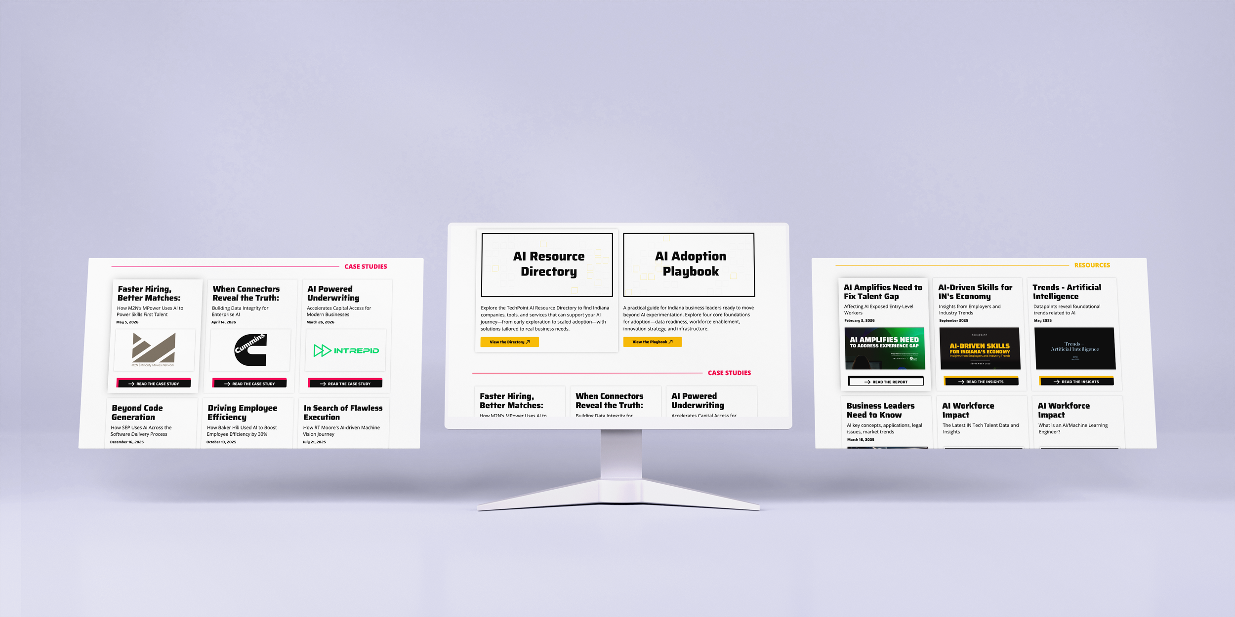
Artificial Intelligence Site Redesign
Artificial Intelligence (AI) is the umbrella term for the practical use of machines, particularly computer programs, to carry out tasks that normally require human intelligence.
Old Site Design
Pain Points
Visual Hierarchy
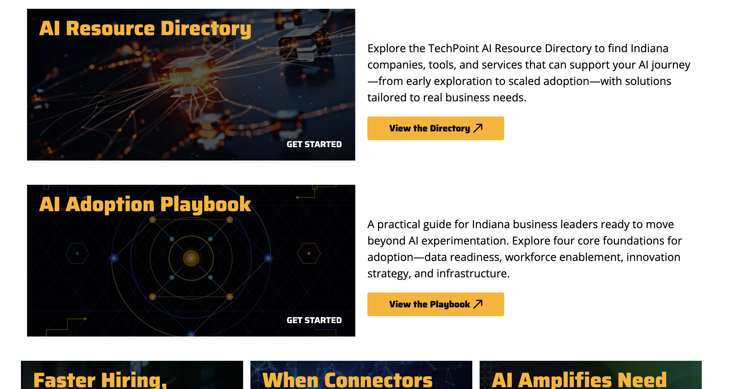
The large hero cards (Directory, Playbook) feel disconnected from the smaller grid cards below — no clear visual system tying them together.
"GET STARTED" text overlaid on images at the bottom of cards is easy to miss and feels like an afterthought.
Typography & Readability
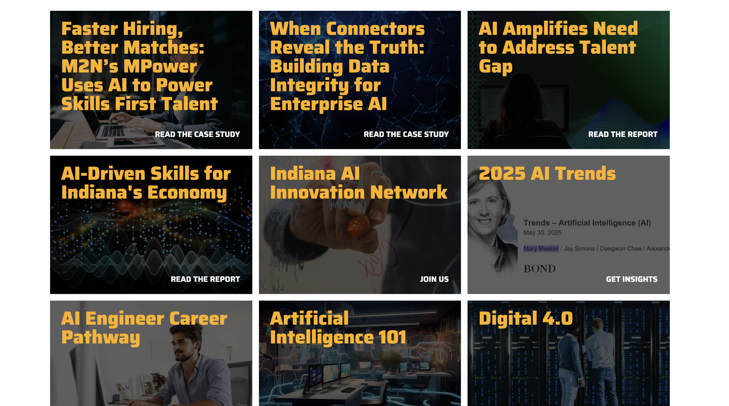
Yellow bold italic headlines on dark, busy photographic backgrounds create legibility issues — especially on the grid cards where contrast varies wildly by image.
The body text on the right side of the hero cards is plain and unformatted, sitting in a lot of white space with no visual anchoring.
Layout Tension
The two-column hero layout (image left, text right) clashes awkwardly with the three-column card grid below — the page feels like two different design systems stacked.
Inconsistent card sizes make the grid feel unbalanced and arbitrary.
Image Choices
Stock "glowing neural network" and tech imagery is generic and doesn't differentiate TechPoint's brand or Indiana focus.
Images are very dark and similar in tone, making the grid visually monotonous.
CTA Design
The yellow "View the Directory / Playbook" buttons are the strongest element on the page but compete with the yellow headlines, diluting both.
"READ THE CASE STUDY," "JOIN US," "GET INSIGHTS" labels are inconsistent in style and placement across grid cards.
Spatial Rhythm
The page lacks breathing room — content feels packed without intentional use of whitespace to create flow between sections.
Competitive Analysis
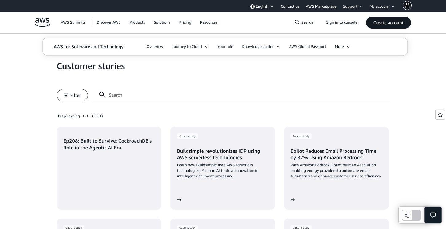
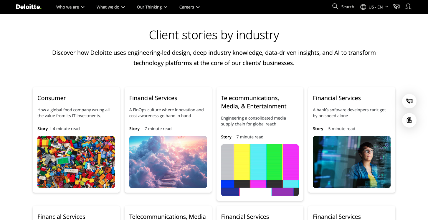
After reviewing multiple company case study sites, AWS Customer Stories and Deloitte Client Stories emerged as the strongest models — AWS for its outcome-first headlines, quantified benefits blocks, and logo-forward card design that builds instant B2B credibility, and Deloitte for its industry taxonomy, consistent card structure, and read-time indicators that reduce friction and help visitors self-select into the most relevant content.
Case Study Sites
Site Strengths
Outcome-First Headlines The page titles lead with the transformation result, not the company name — "Showpad Revolutionizes Sales Enablement Using Anthropic's Claude Models in Amazon Bedrock." The visitor immediately understands what happened before reading a word of body copy.
Quantified Benefits Block at the Top Before any narrative, AWS surfaces a tight grid of hard numbers — "12 AI features released," "2–3 second time to inference," "30% improved response time at one-third of the cost." These are scannable proof points that let a busy decision-maker assess relevance in seconds without reading the full story.
Clear Story Architecture with Named Sections Each case study uses consistent labeled sections — Opportunity, Solution, Results — that mirror how a business reader already thinks about a problem. You can jump directly to the part that matters to you rather than hunting through prose.
Company Context Block A short "About" section grounds the reader quickly. Industry, founding context, scale, and geography in three sentences — enough to assess "is this company like mine?" without a lengthy biography.
Featured Carousel + Full Grid Structure The index page separates featured stories (rotating spotlight) from the browsable grid below, giving visual hierarchy to the most compelling content while keeping the full library accessible.
Logo-Forward Card Design Cards lead with the company logo, which is especially effective for a B2B audience who recognizes brands — it creates instant social proof before reading the headline.
Site Strengths
Clear Industry Taxonomy Each card is labeled with its industry category (Financial Services, Consumer, Government & Public Services, etc.) right at the top, before the title. This lets a visitor scan by relevance instantly rather than reading every headline to find what's applicable to them.
Consistent Card Structure Every card follows the same pattern — industry label → headline → content type (Story/Article) → read time → image. That predictability reduces cognitive load and builds a rhythm that makes the grid easy to browse.
Read Time as Commitment Signal Showing "4 minute read," "7 minute read," etc. is a small but powerful trust move. It respects the visitor's time and removes hesitation before clicking — they know exactly what they're getting into.
Conversational, Benefit-Led Headlines Headlines like "A bank's software developers can't get by on speed alone" and "New day, new cloud…new future!" are written as narratives, not feature lists. They create curiosity without being vague, which is the right balance for case study content.
Content Type Labeling Distinguishing between "Story" and "Article" tells the reader what format to expect — a narrative case study versus editorial thought leadership — reducing mismatched expectations after the click.
Supporting Context Above the Grid The introductory line — "Discover how Deloitte uses engineering-led design, deep industry knowledge, data-driven insights, and AI..." — primes the reader on the value lens before they dive into individual cards, which is good progressive disclosure.
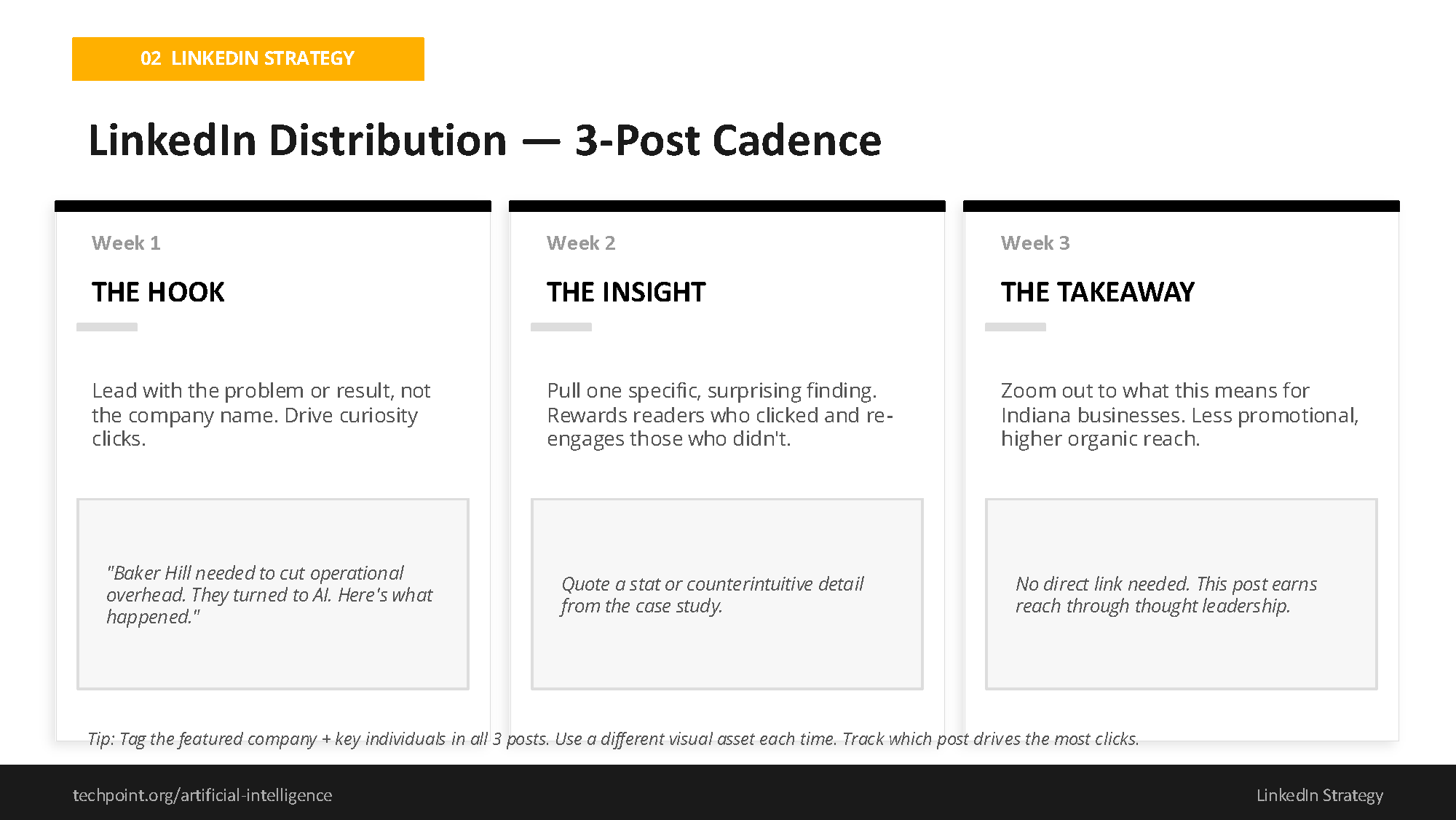
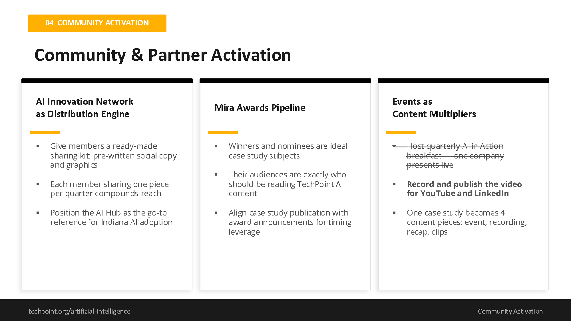
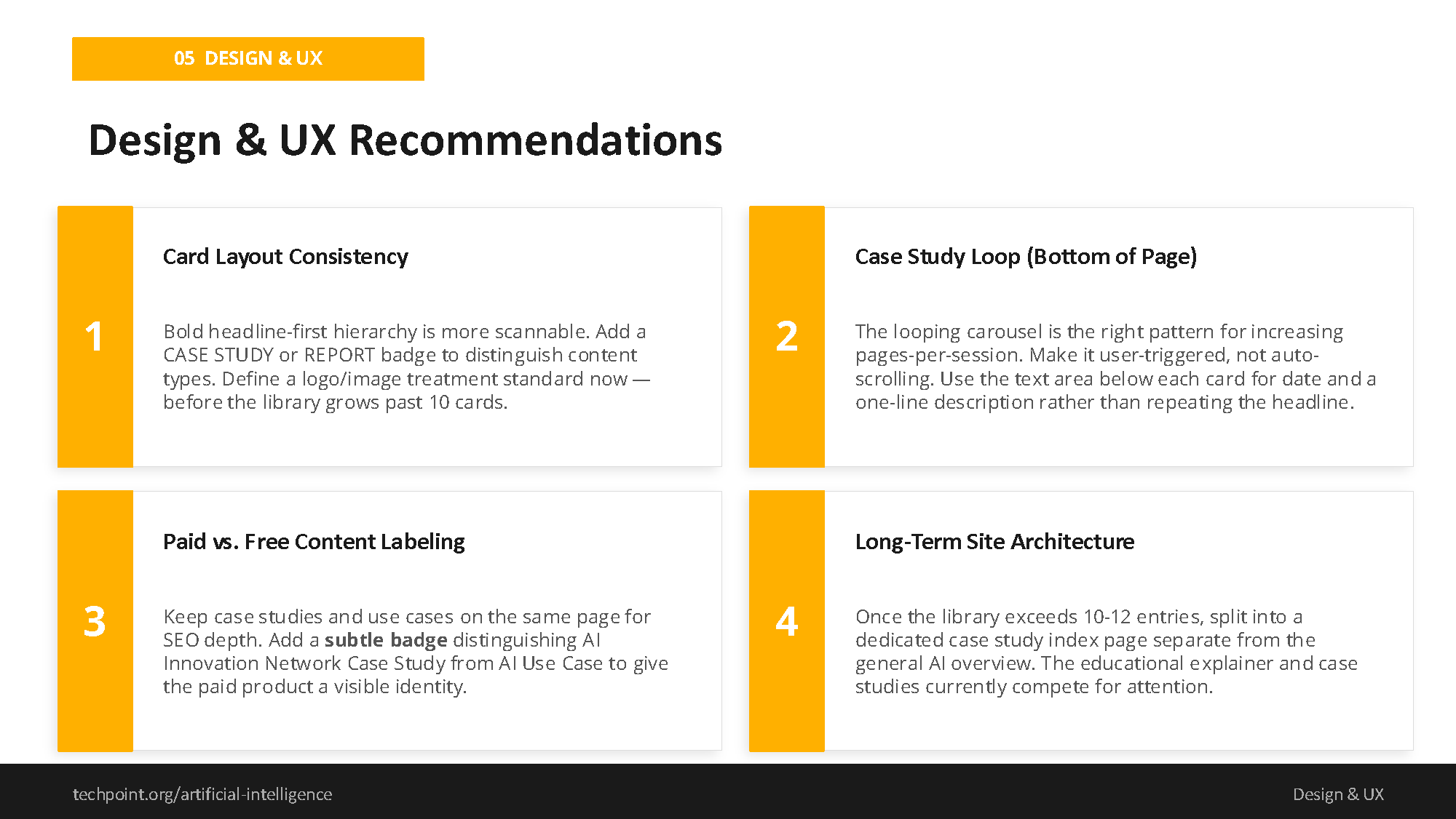
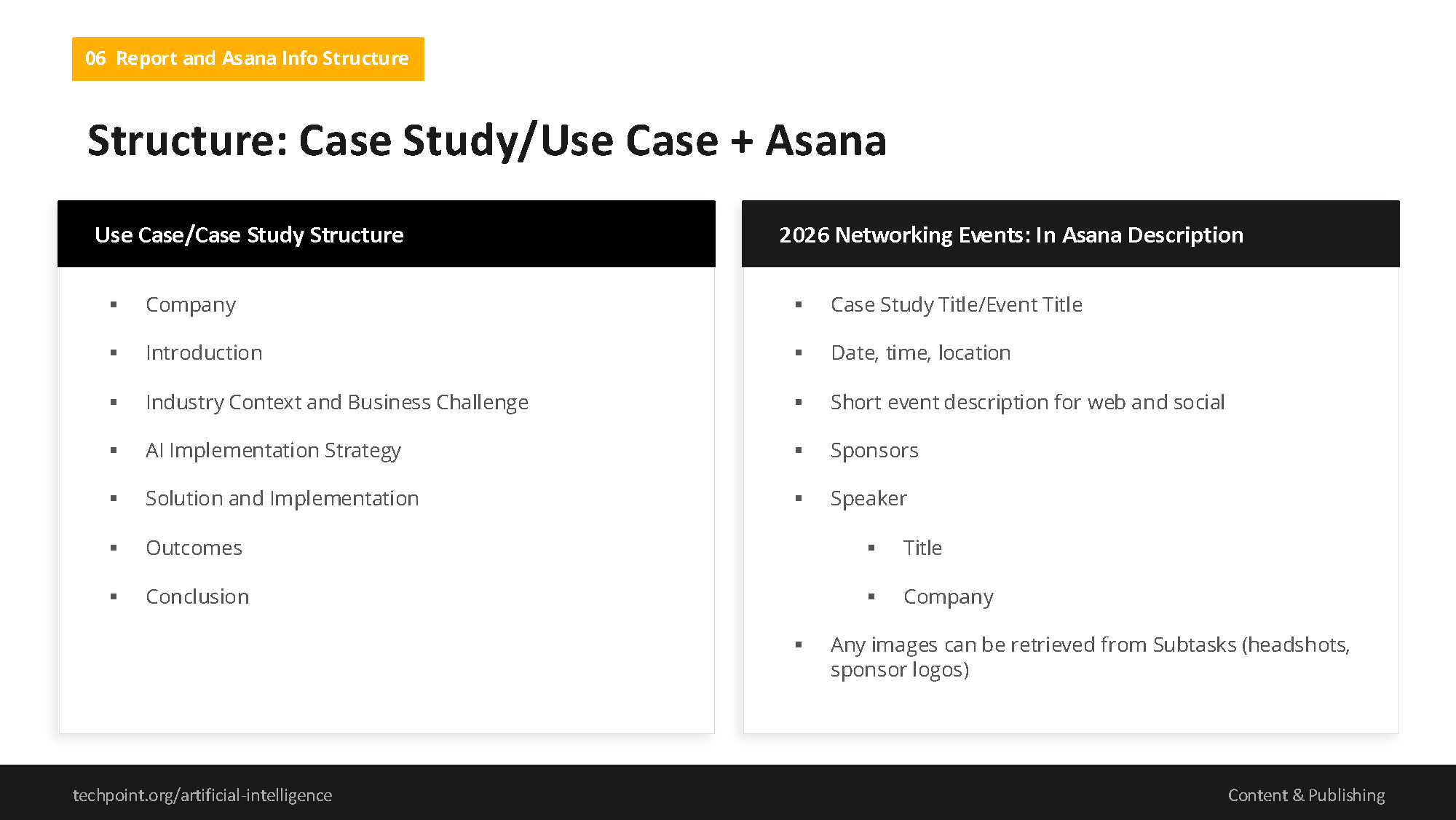
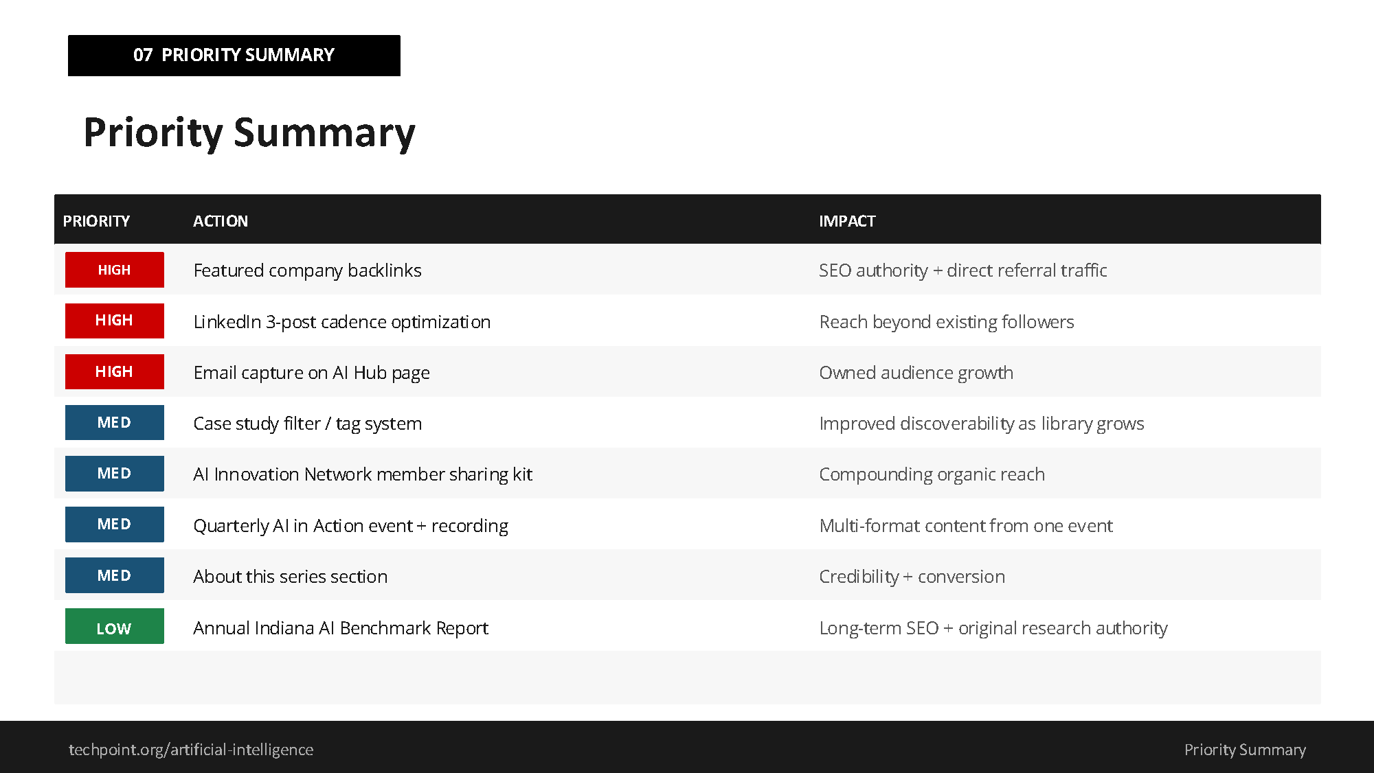
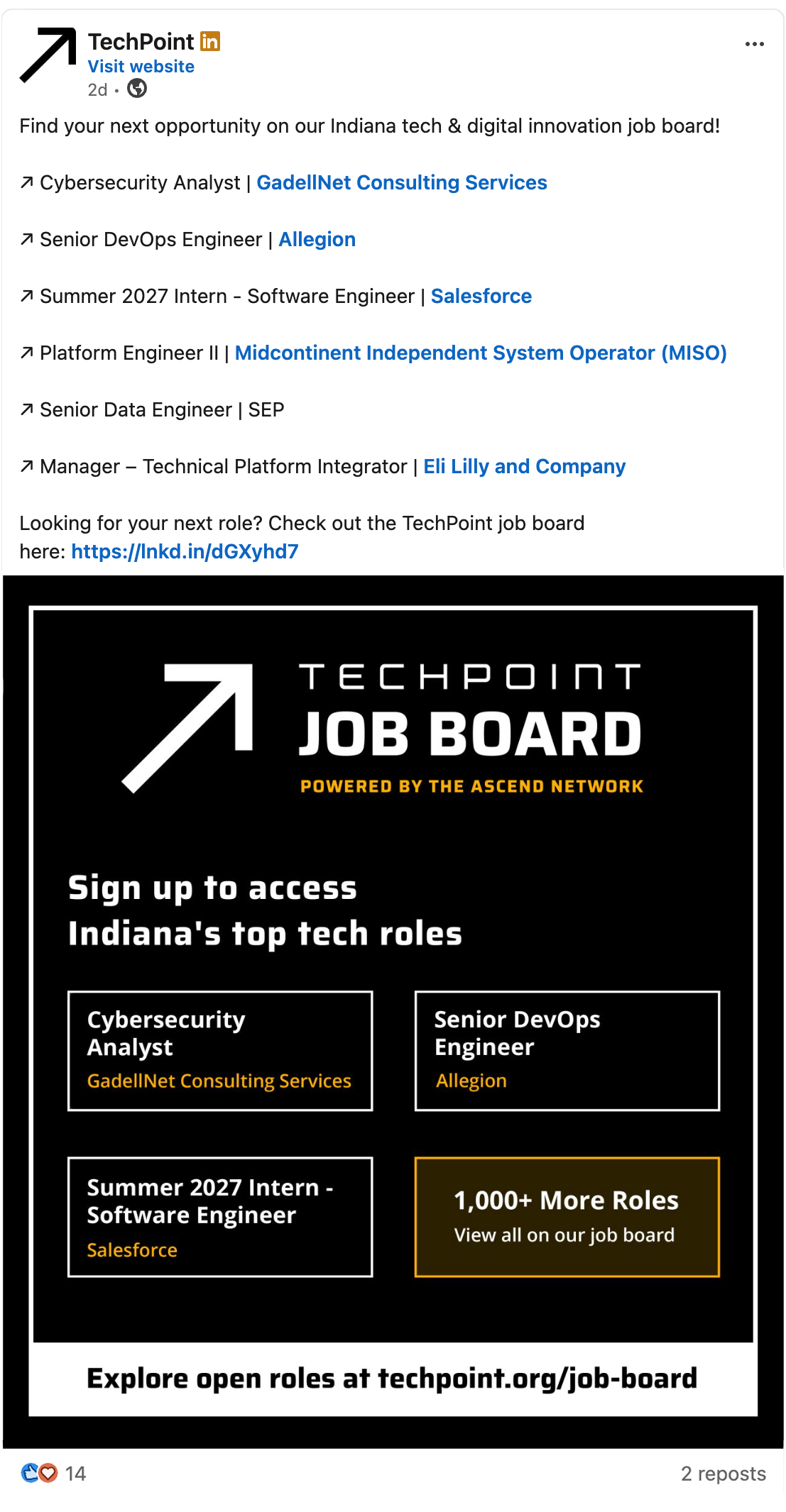
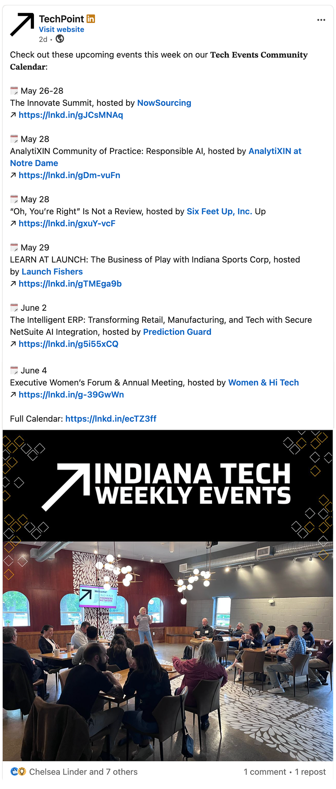
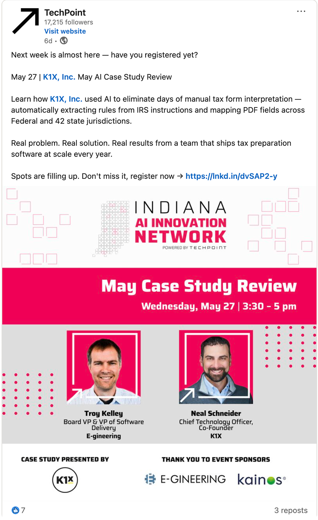
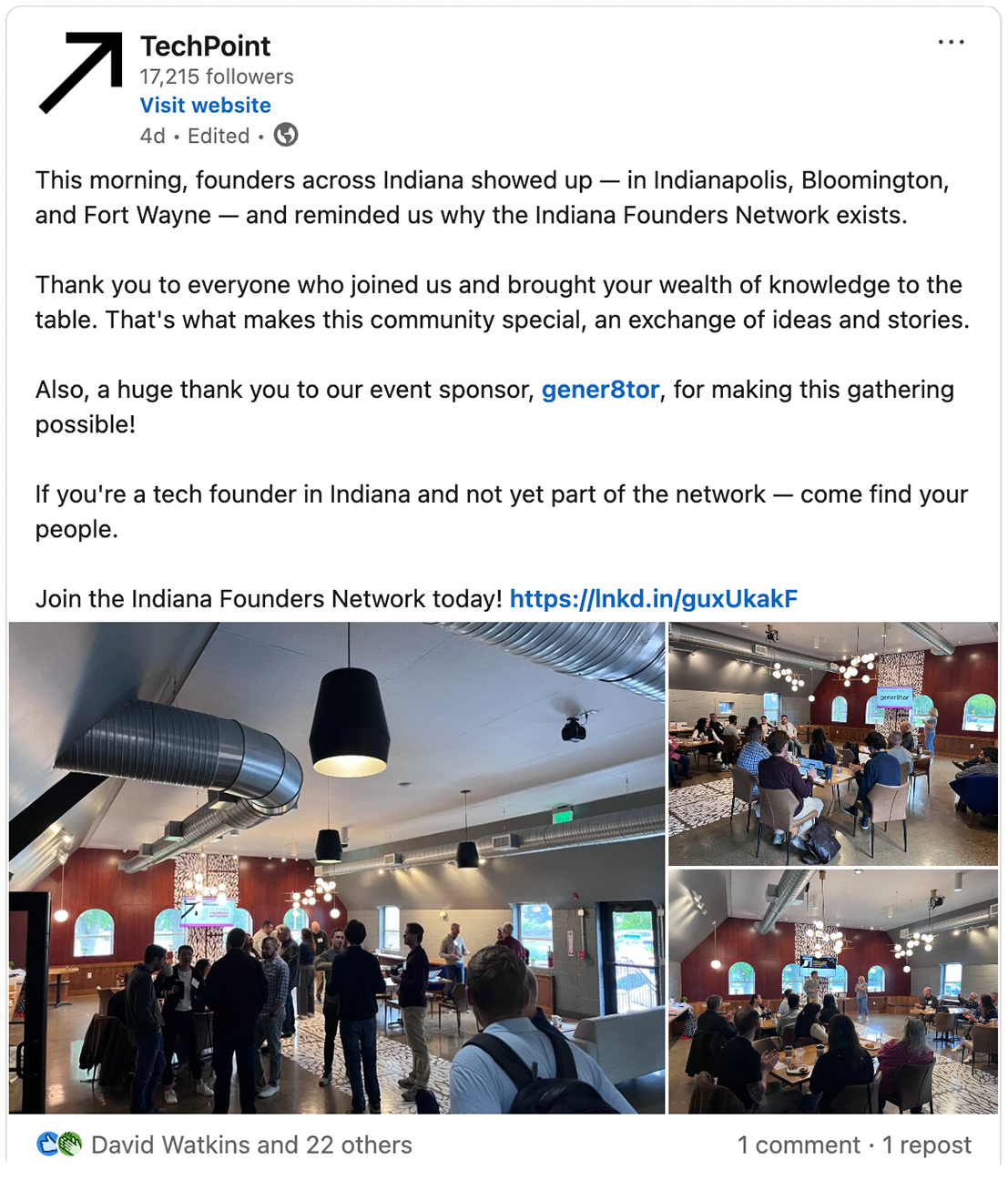
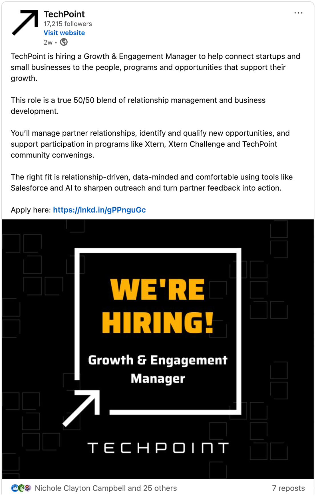
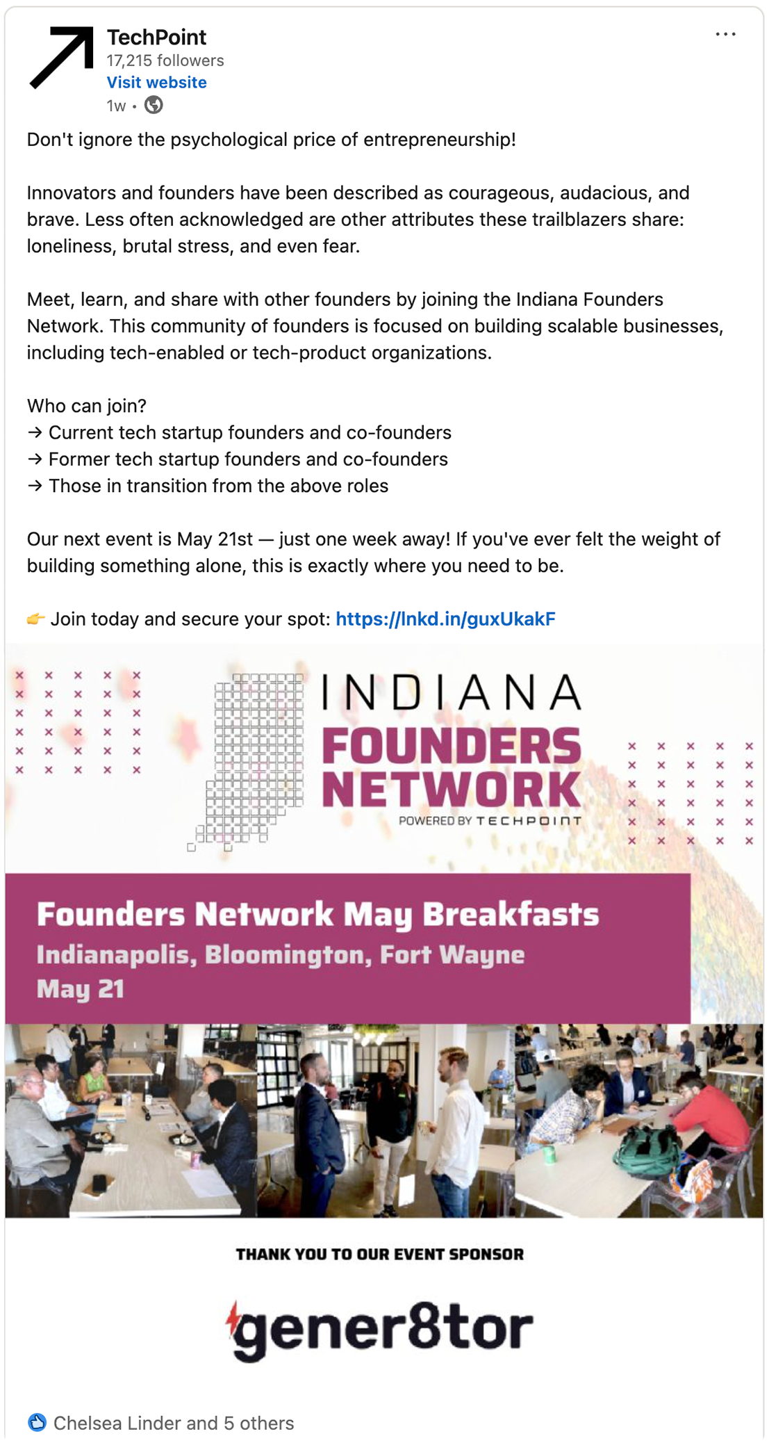
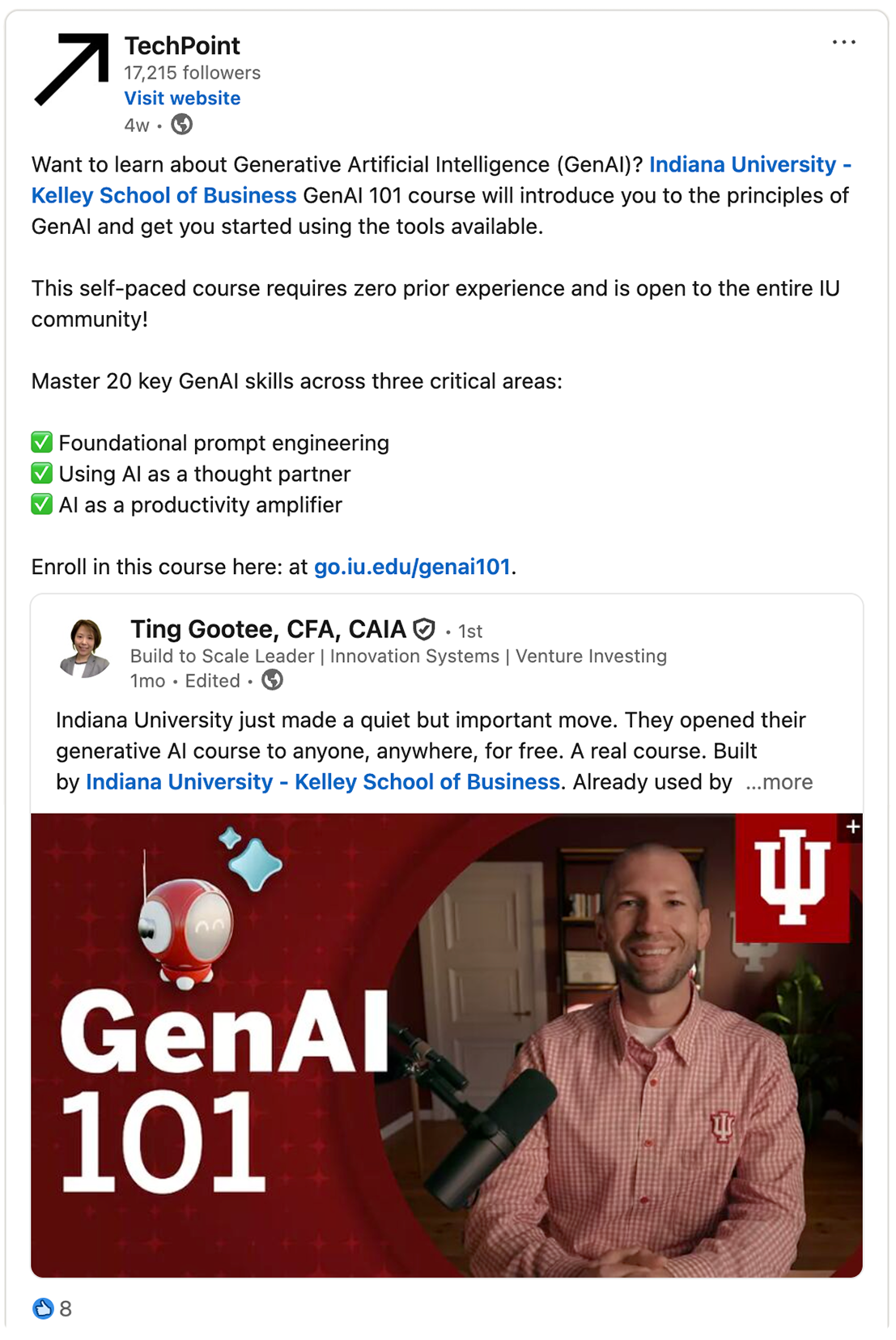
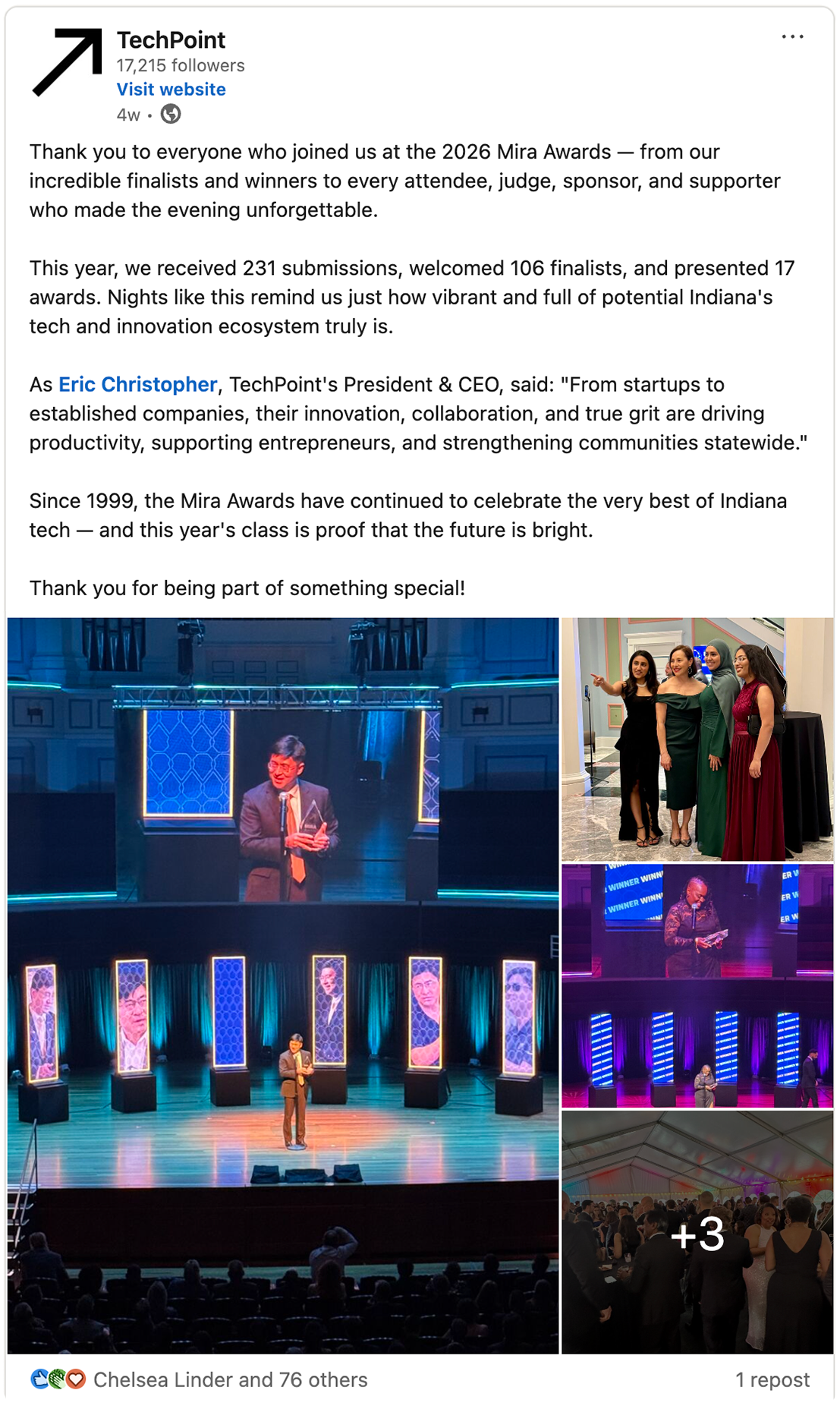
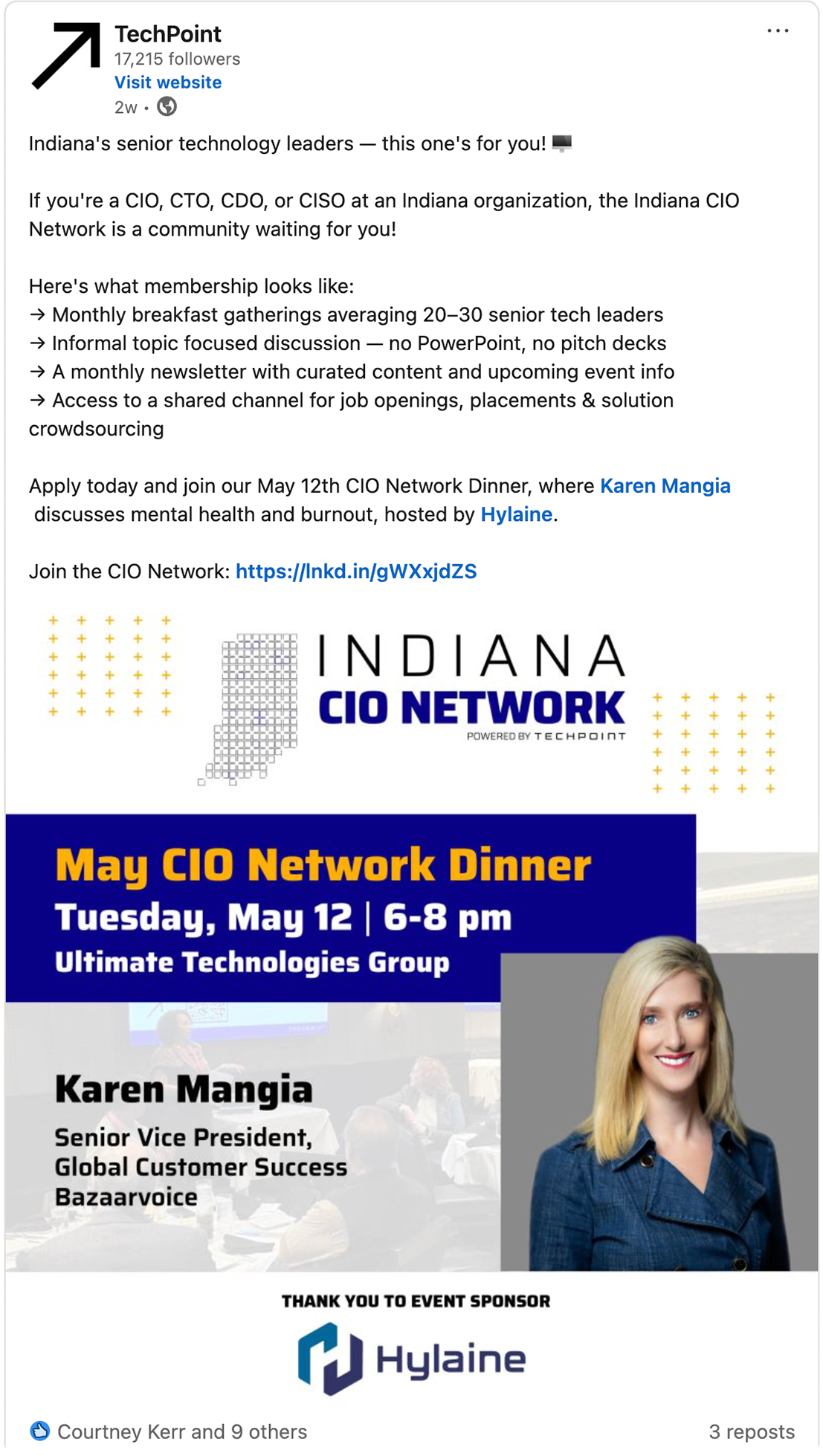
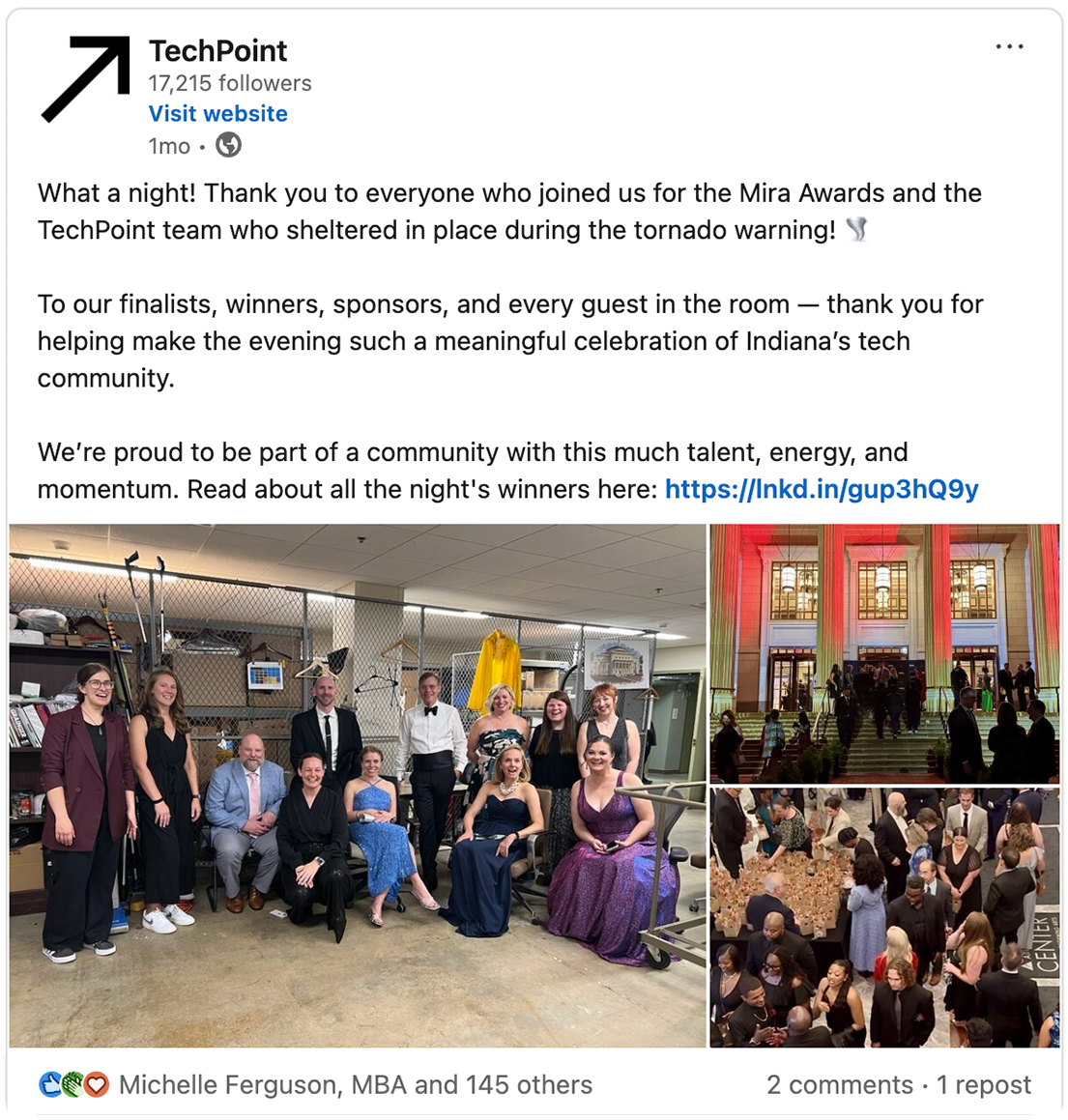
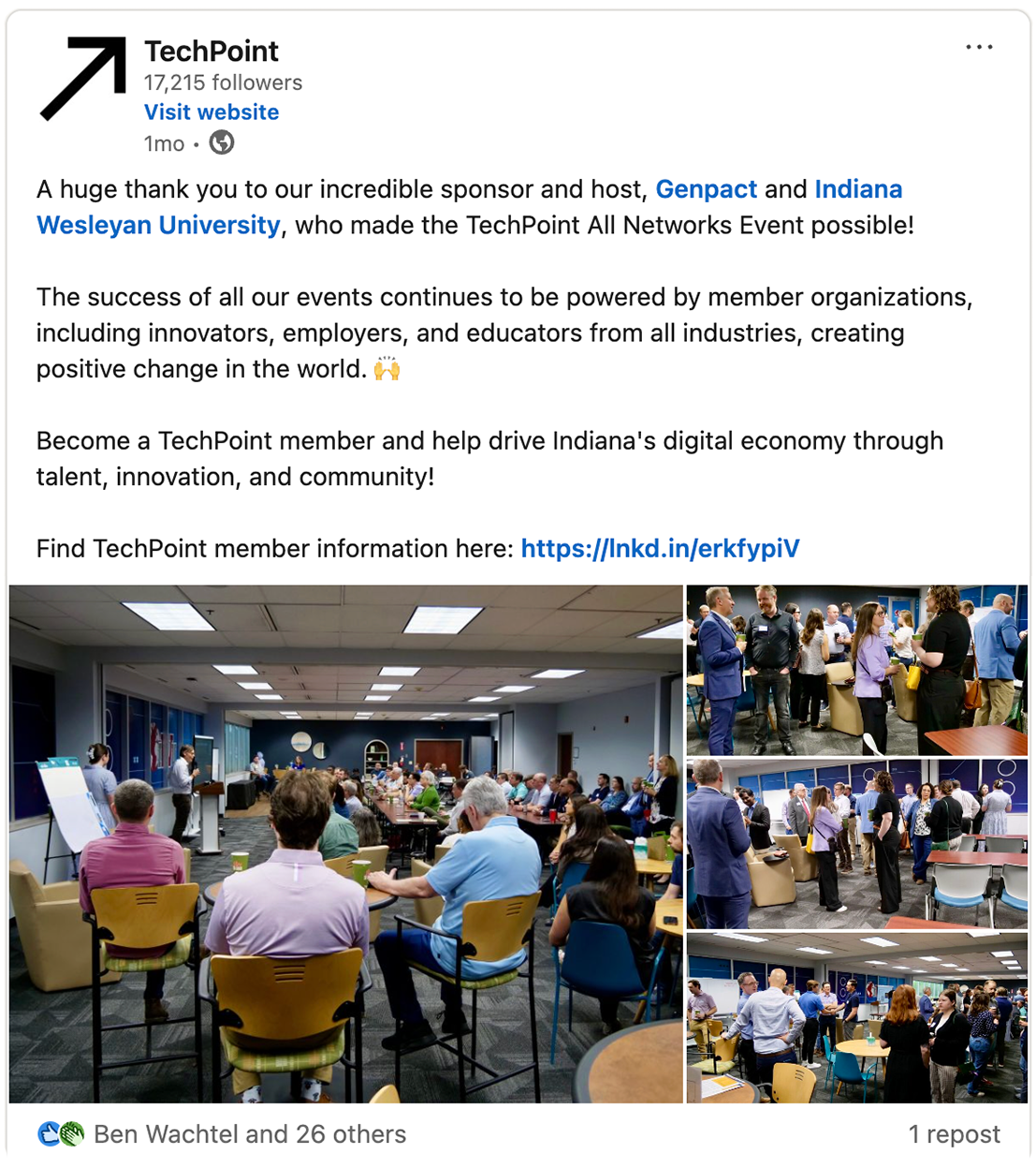
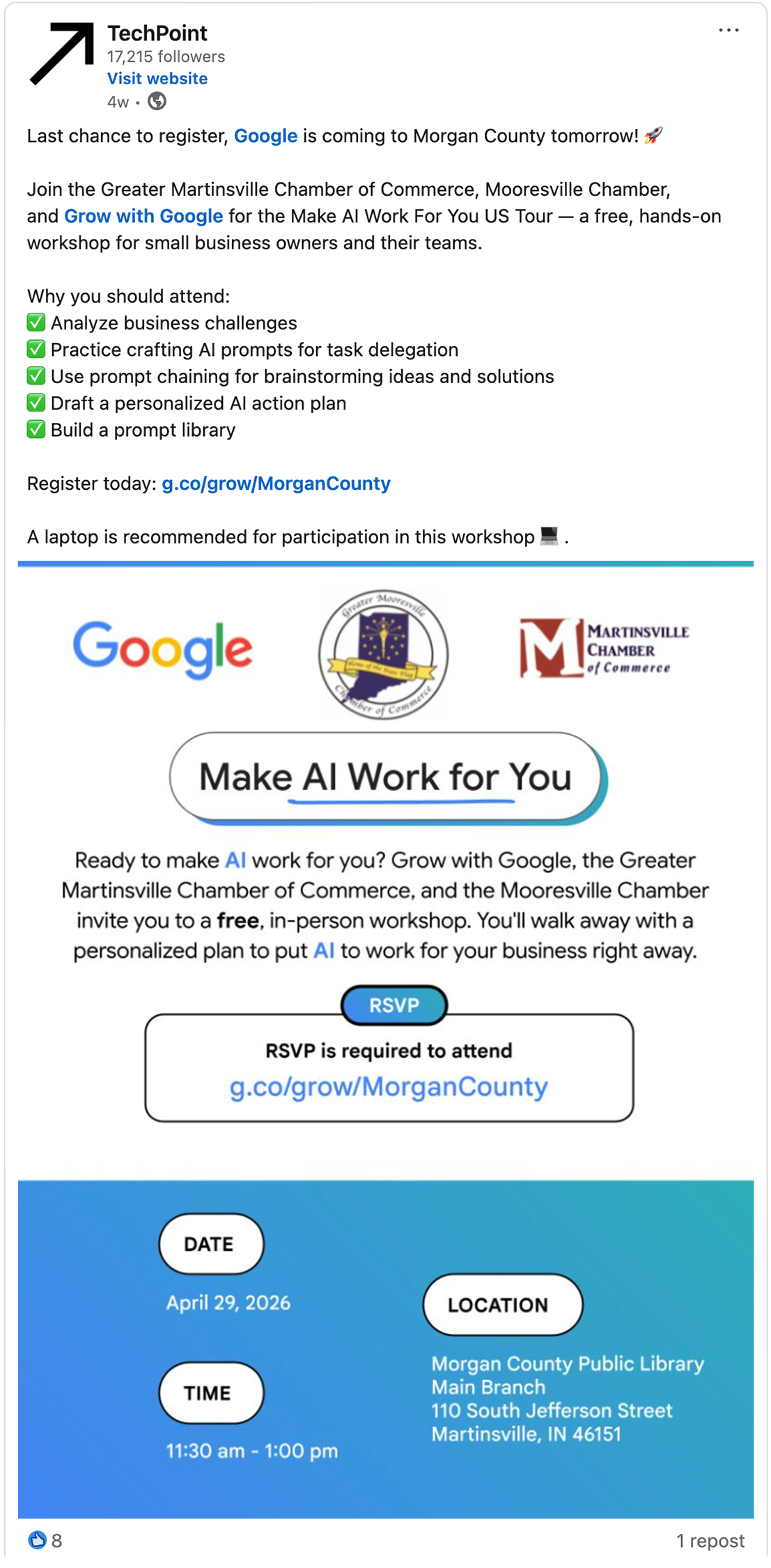
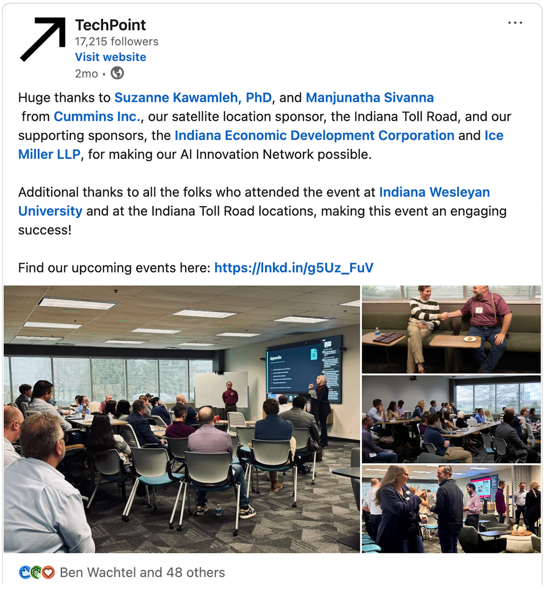
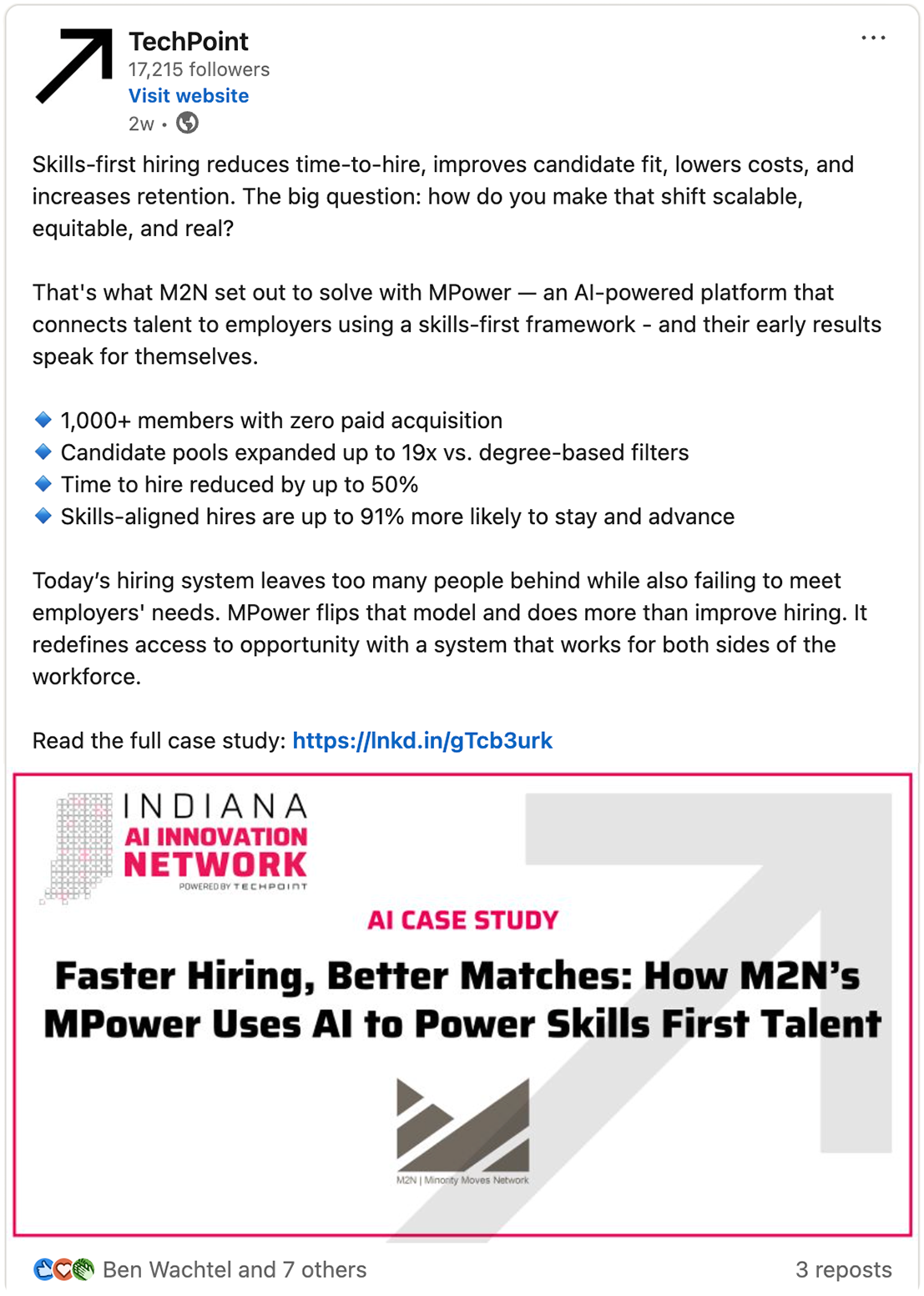
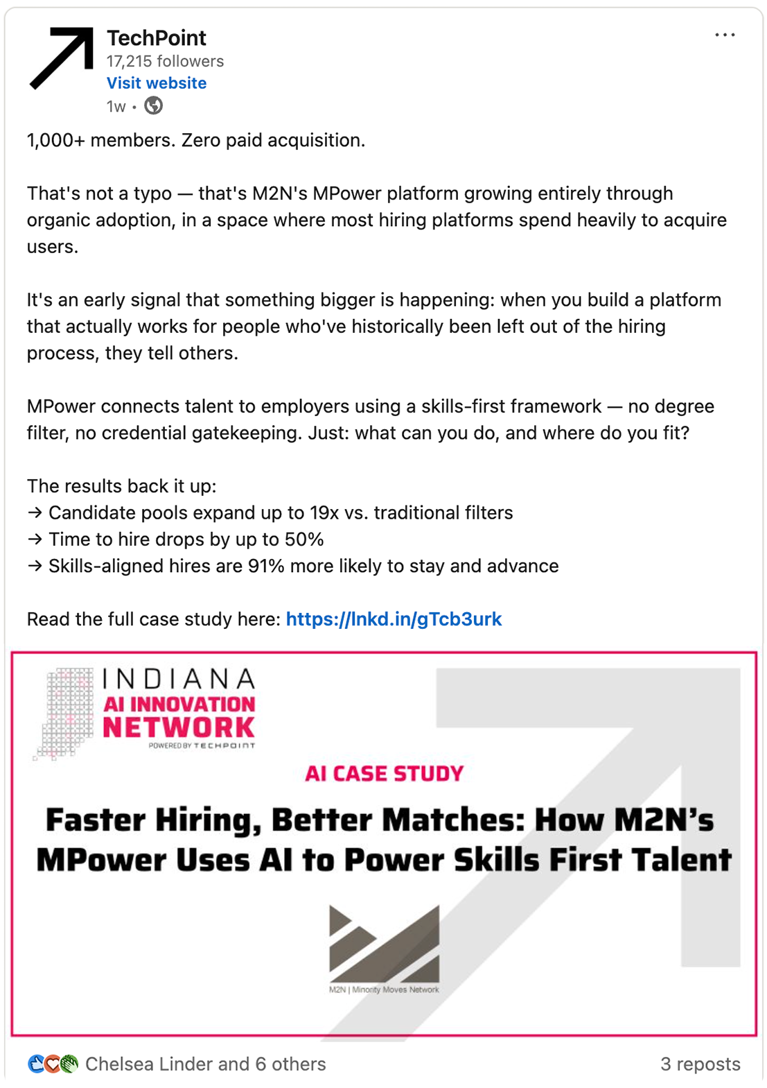
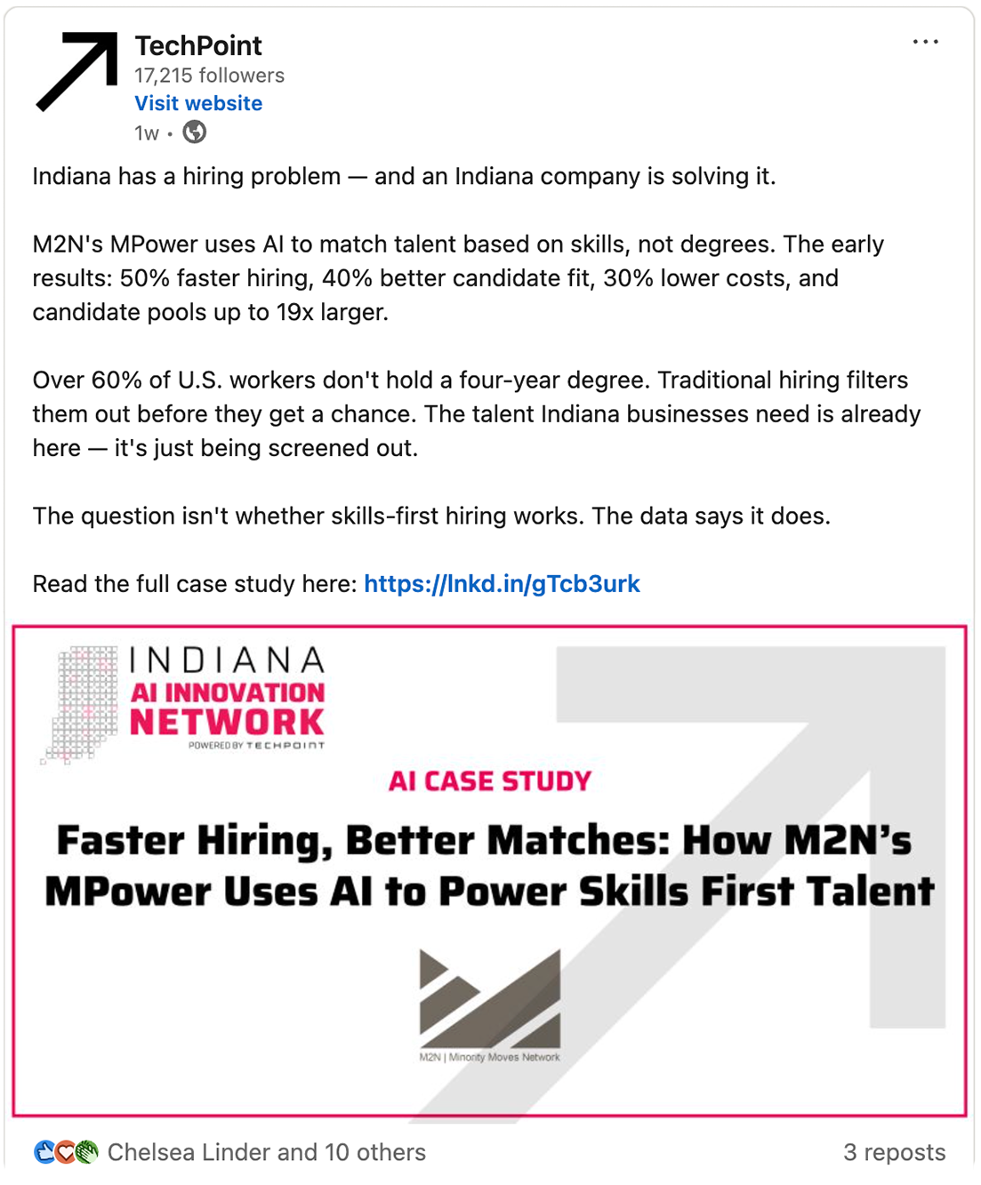
LinkedIn Distribution - 3 Post Cadence
The Hook
The Insight
The Takeaway
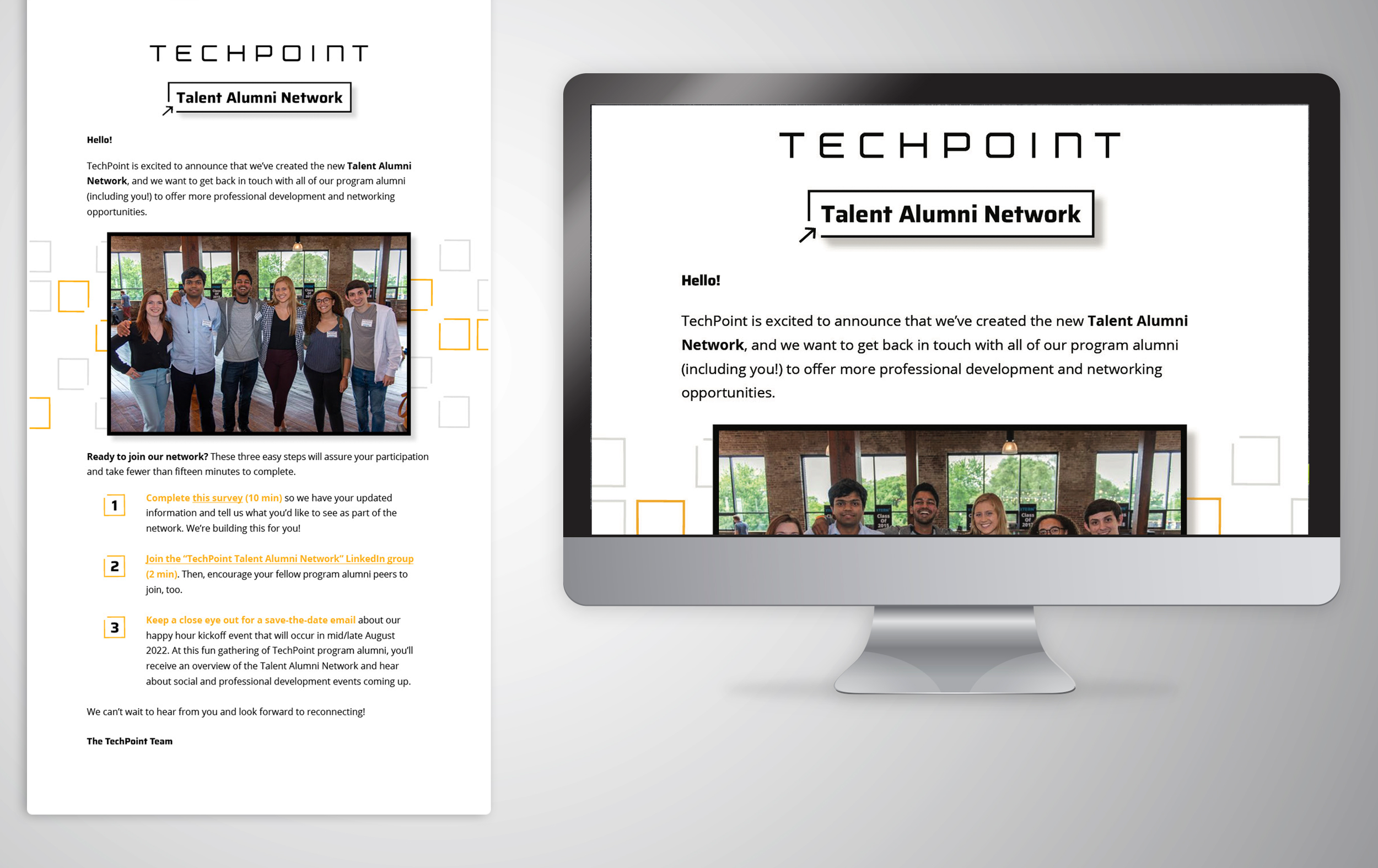
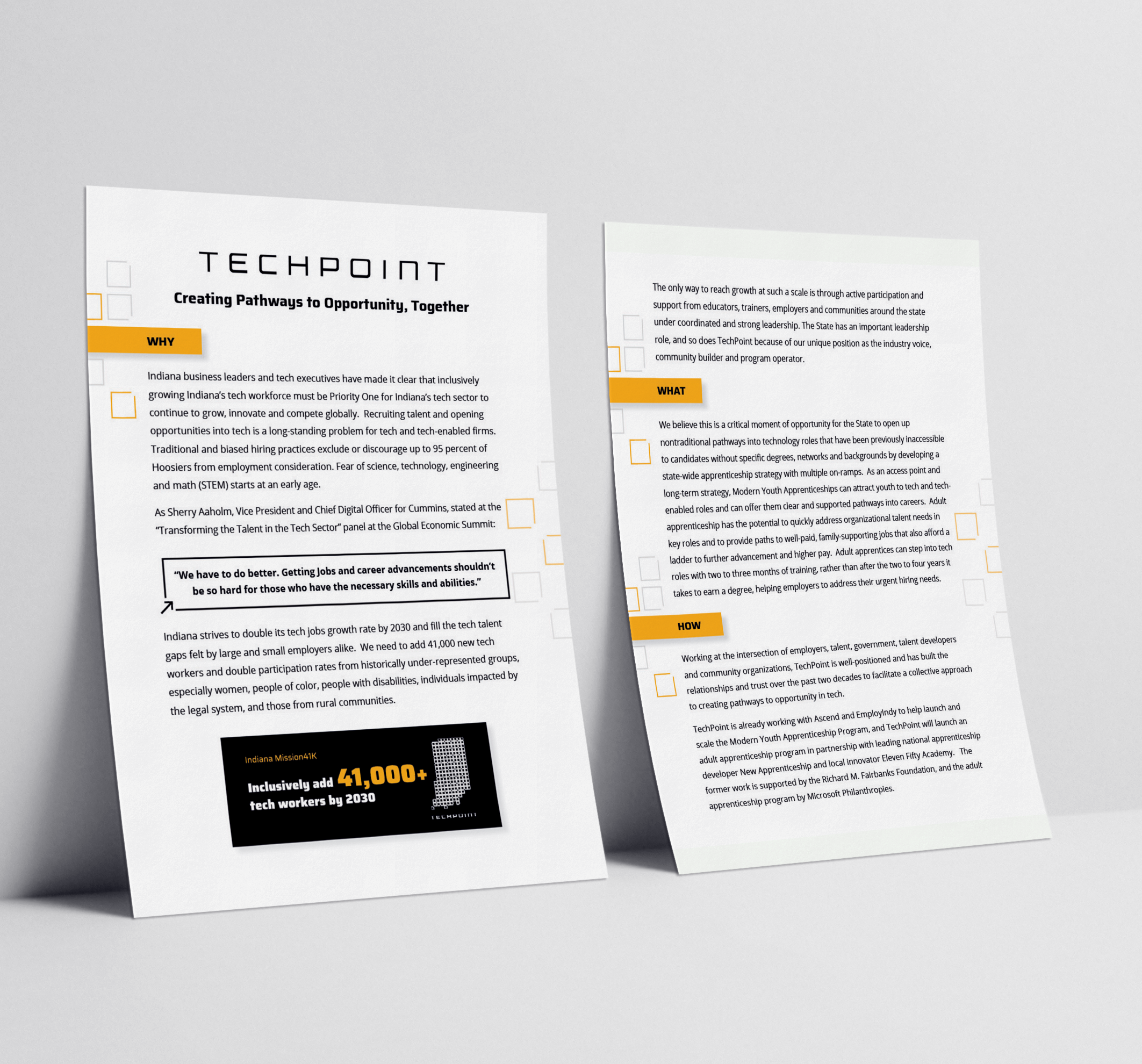
Digital and Print